When a designer is creating anything visual, it is important that they keep the specific needs of their target audience in mind. This insight is then intentionally used to construct designs that are meant to successfully capture and hold one's attention. Creating artistic components that can be interpreted for the masses is crucial, and this includes those who are visually- or color-impaired.
To use the term "color-blind" is actually improper, because only a very small percentage of humans are born with true monochromatic vision, unable to see anything but black and white. "Color-deficient" would be more accurate term for most visually impaired people who can actually see almost every basic color, yet have a hard time distinguishing the difference between two colors that are similar (in tone, brightness, etc.). The cause of this issue can range from genetics, to the result of a disease, to the development of this problem over time due to aging or the prolonged use of certain medications.
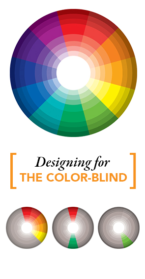
When considering color options in your design, keep in mind that the color-impaired may only be able to see 20 hues, while those with excellent color vision can see more than 100. Although there are different types of color impairment, one in particular has difficulty deciphering between blue and green as well as between red and green. Because there are several categories of being "color-blind" (and severities, of course) it is also important to note that some people are less sensitive to red light, while others green or blue.
The most common form of color impairment is known as red/green color blindness. This does not mean that sufferers mix up just red and green, but rather, they mix up any colors with red or green undertones. For example, a red/green color-blind person will confuse shades of blue and purple because they can't "see" the red element of the color purple. Because color combinations are so critical for the viewer, it is important to be mindful of such information when creating a visual display. One way to combat this issue is to include symbols. This is particularly helpful for video or computer games that consist of one constant shape, each individually defined by colors, but allowing the symbol to act as a third element of dimension. The average eye would be able to decipher the difference between a red and green circle, but if the circles have separate distinct symbols, it strengthens the overall utilization of the game.
As technology continues to progress, the frequency of digital device use is higher than ever. Websites are a great place to practice such knowledge in design, as small details such as a "hover-over" button that changes color when the cursor is present, should perhaps be changed from its default color. Those who are color-impaired may not be able to recognize if he/she has properly hovered over the website's tab or not.
Another thing to keep in mind when designing for the masses is hierarchy. Font perception is key. By using different sizes and weights or contrasting thick and thin/serif and non-serif typefaces, the eye will naturally be led in the direction defined by the opposing text characteristics.
Creating effective, legible, and eye-catching designs for the masses is not easy. But isn't that the challenge all designers face with great determination? Focusing heavily on a balanced use of color is one of the most essential elements needed when attempting to appeal to those with color deficiency. Try it for yourself!
[ what's inside ]