As a professional, or for anyone hoping to make an effective first impression, a compelling business card is key. It could make the difference between a potential client calling upon you, or simply tossing your card in the recycle bin. Here are a few tips to ensure that your card gets the attention it deserves.
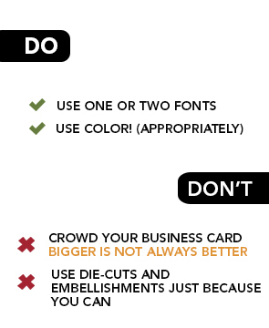
Use One or Two FontsThere's no need to unload every font you've ever downloaded from the internet onto your business card. One font family can go a long way on a small canvas. Use bold text or a spot color to call out important information (never underline). Also, make sure to stick with a legible font for contact information. Which leads to…
Bigger is Not BetterBecause it's such a small area, crowding your card with large copy is never a good idea. Allow sufficient white space and text sizes that are balanced according to the importance of the copy that is being displayed. Try 12pt fonts for headline copy on a standard 2” x 3.5” area. Contact information should be sufficient at around 7pts (for most fonts) and will still be legible.
Foils and Glosses and Die Cuts… oh my!Many printers offer extra embellishments that can add to your card's originality. It’s never a good idea to add these elements just because you can. A simple, yet intentional spot gloss can go a long way. Also, consider how paper choice comes into play. If you decide on a colored or textured stock, this can be all the embellishment your card needs.
Make Your Brand MemorableThis doesn't mean you have to spend a fortune and create a kitschy card. Make your card stand out from your competition in some way that reflects your brand. If you have a fun business, by all means, give your business card a whimsical look. A black and white corporate card has no place in promoting a popsicle shop, for example.
Color is KeyThere are no limits to the colors you can use on your business card, but choose colors wisely and sparingly. A neutral shade such as gray or black, plus an accent color or two can really make a business card pop. Pull colors from your logo, but don't feel obligated to use them all. Again, a business card is a small canvas, so make it work for you. Also make sure you're choosing colors that will be legible on your paper choice.
If You Must Go With a Template…Choose wisely. Determine the type of impression you want to make on your audience and find a card that best reflects your image. It is important to consider the types of individuals who you want to do business with, and strive to find a design that will attract their attention.
With all of these tips in mind, you should be able to create the best card for your business or personal use. Because as they say, you only get one chance to make a first impression.

